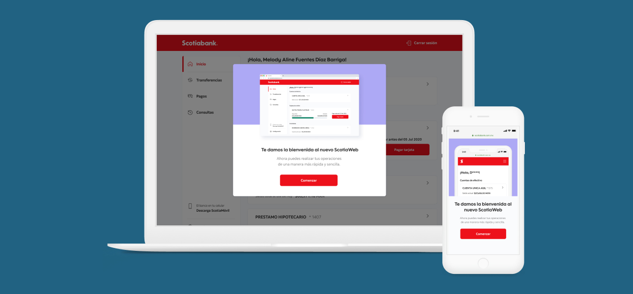
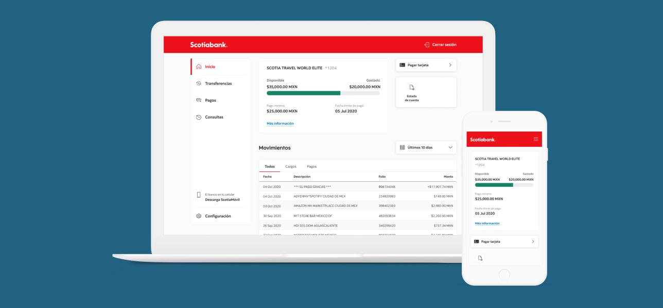
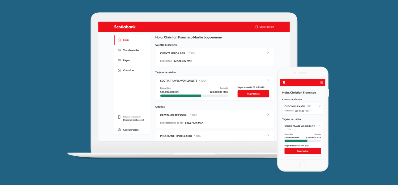
ScotiaWeb
- Category: Web
- Client: Scotiabank
- Project duration: March 2010 - May 2022
- ScotiaWeb
Online Banking App
Role: Product designer
Led the digital transformation, revamping the entire online banking experience. Developed the strategy for growth, driving UX design from concept through implementation.
Case Study
The Challenge: Web App Redesign
I was assigned to a scrum team with another UX designer and a copywriter to simplify and improve navigation and usability for whole online banking app before launching it to market.
The problem
The app was migrated to a new back end in a new infrastructure but keeping the old user experience.
Complex navigation, big cognitive loads, over explained contents
Project deadline: 5 weeks
Solution
First of all, stablished a UX workplan with deliverables for development
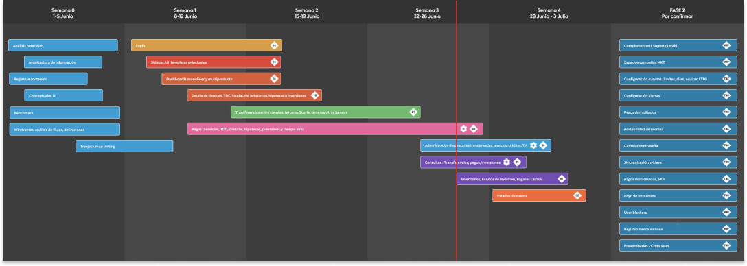
Analyzed cualitative and quantitative data from current version to understand motivators and frustrations from web users.
Made an expert review to identify and prioritize usability issues on an effort–impact scale graph.
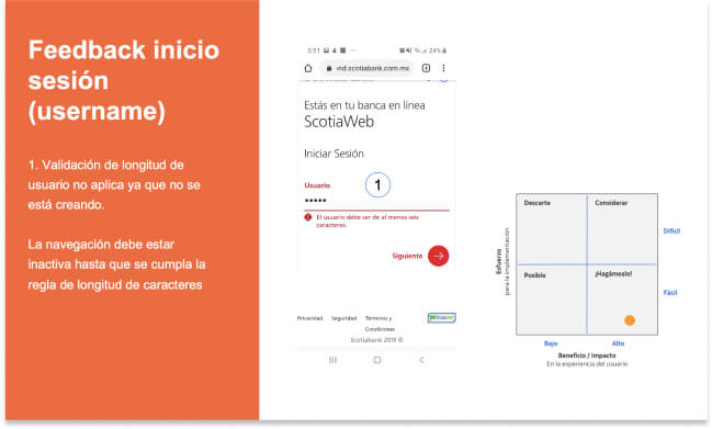
Since navigation problems were found, we made cardsortings and treeejacks with users for better understanding of users mental models.
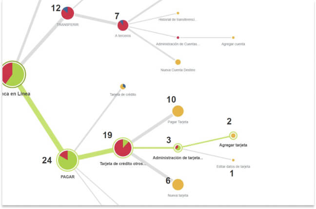
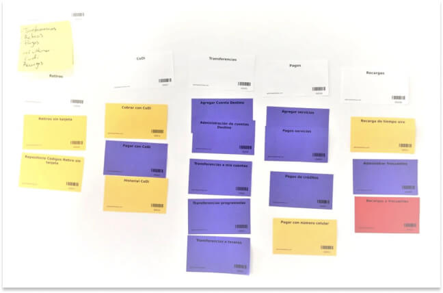
Took study insights for defining a new information architecture:
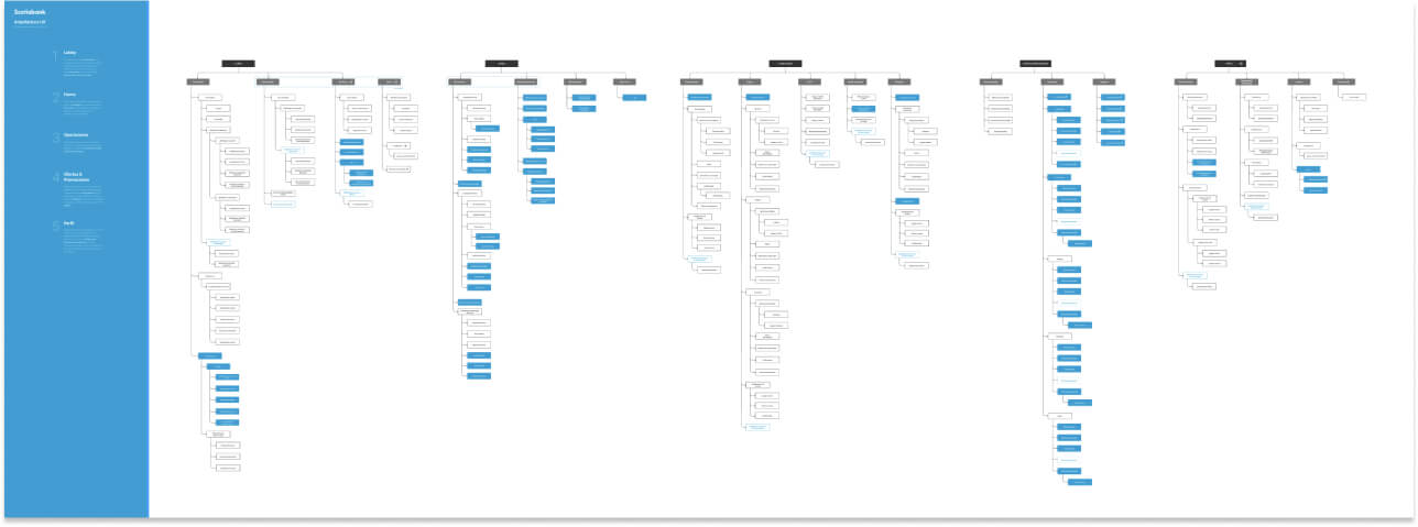
Moodboards for benchmarking and getting some inspiration
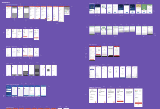
Design
Wireframes for defining navigation patterns and cleaning up contents
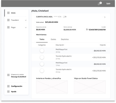
Defined new UI styles and components for web responsive and desktop views including high fidelity prototypes for usability testing
Collaboration with research teams for setting up user interviews and usability testings
Applied learnings to a final version
Results
- Positively impacted +500k clients, reflected on more adoption, less attrition, and better NPS
- Cleaner and consistent UI, easier navigation and clearer content
- Simplified processes for completing main banking tasks
- Better usability and accesibility
- Aligned with global design system guidelines and branding
New navigation
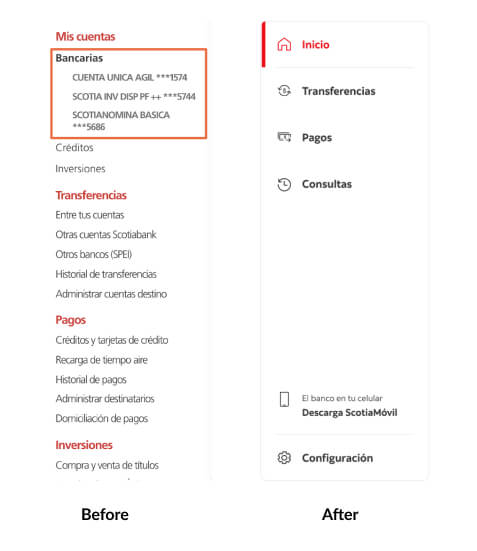
Sign In
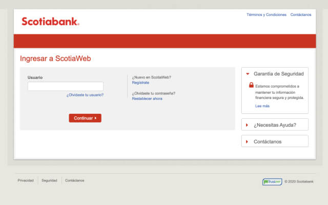
Before
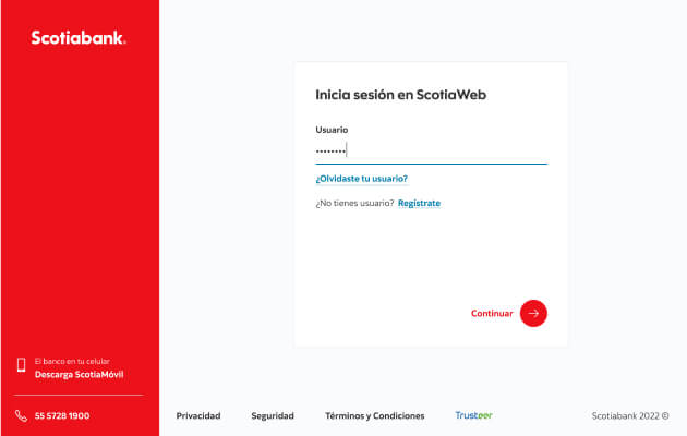
After
Main dashboard
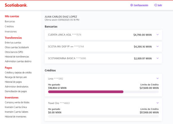
Before
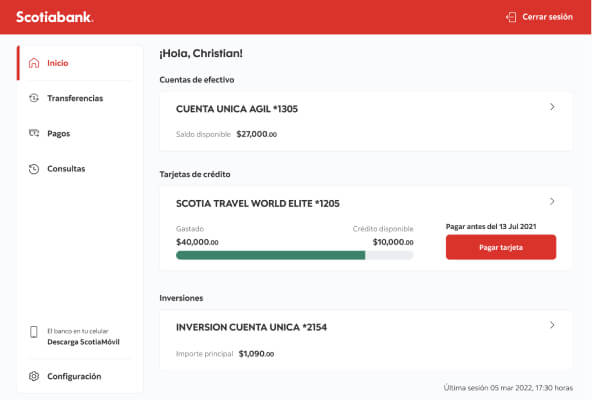
After
Product detail
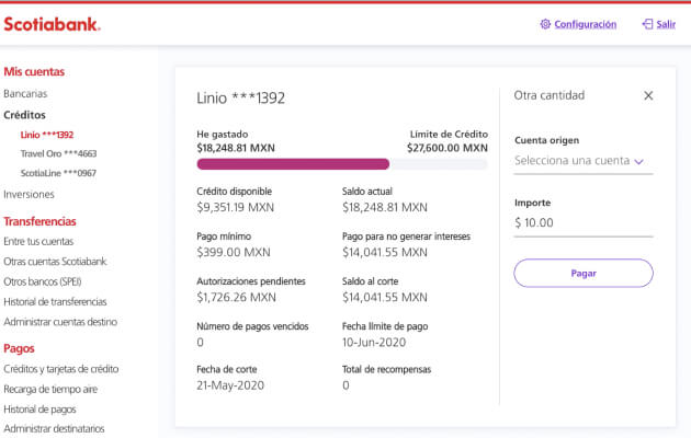
Before
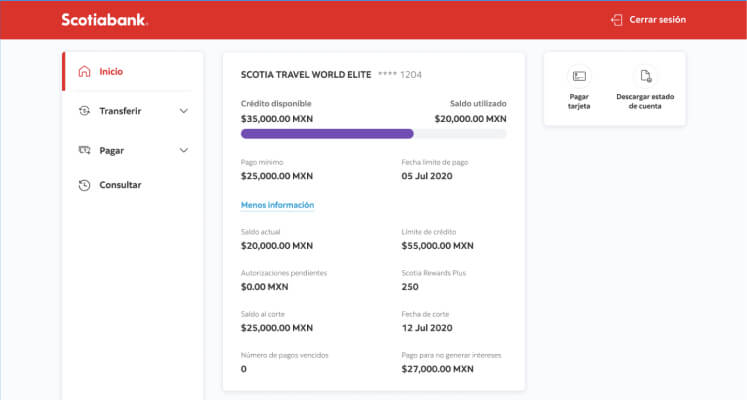
After
Transfers and payments template
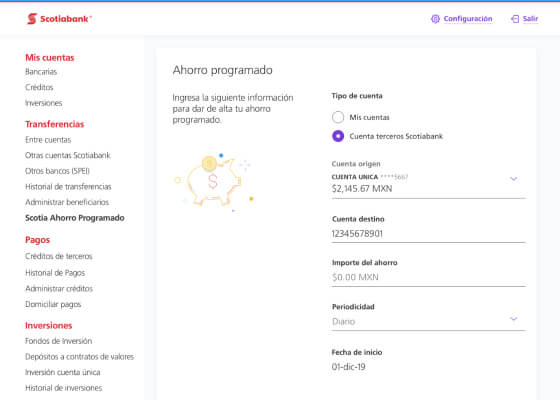
Before

After

