
Web Application Redesign: ScotiaWeb
Project Overview
Client:
Product: ScotiaWeb (Desktop).
Category: Online Banking
Project Duration: 6-week design, within 3 months of development.
Objective: Improve the user experience to ensure a successful market launch after the initial migration phase, which primarily focused on feature parity.
Design Team: 2 UX designers (Including myself), 1 Researcher, 1 UX writer.
My Roles: Product Designer, UX Consultant, Visual Designer.
Key Stakeholders: Product Owners, Business Line Representatives (Accounts, Credit Cards, Loans, Investments, etc.), Scrum Masters, Development Team, Global Design System Team, Design Managers, Digital Factory VP.
Business Goals:
- Digital Transformation of existing banking channels.
- Migrate and onboard existing customers to the new platform.
- Shift transactions from physical branches to digital
- Reduce call center support calls.
- Increase customer satisfaction (NPS improvement).
- Decommission outdated infrastructure to reduce maintenance costs
Challenges:
- Convincing teams that the existing work (built in a waterfall process) was not market-ready.
- Gaining buy-in for a major UX and visual shift while managing a tight timeline and preventing team burnout.
- Enhancing usability and responsiveness while streamlining primary and secondary tasks.
- Removing clutter and redundant content to create clean, intuitive interfaces
- Implementing the latest design system consistently across the platform
High Level Outcomes:
- Enhanced UX: Simplified navigation, curated content, and improved task efficiency.
- Responsive Design: Optimized layouts aligned with Scotiabank’s Design System.
Project Planning
UX Roadmap
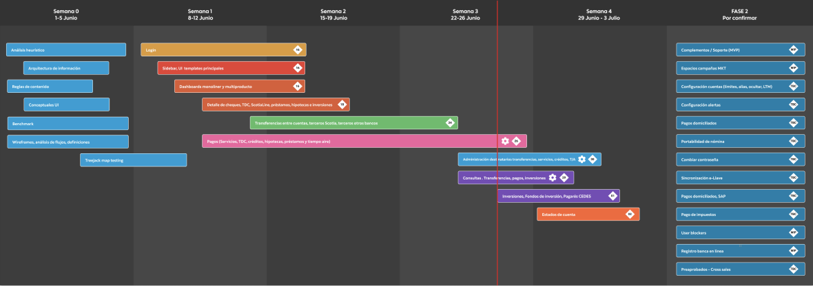
- Defined a UX Workplan: Outlined design tasks and set milestones for dev hand-off.
- Scoped the MVP: Collaborated with Product Owners to prioritize core features and backlog secondary ones for phase 2.
- Adopted a Sprint Zero Strategy: Allowed design to work 1 sprint ahead of development, ensuring smooth hand-offs.
Research
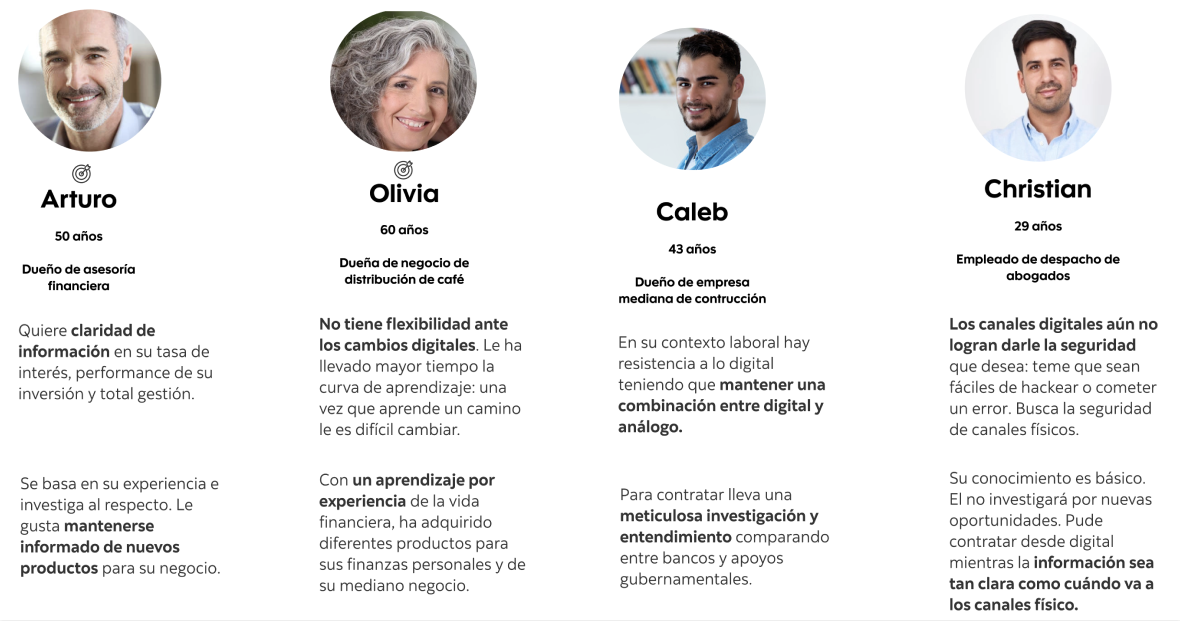
Personas
- Used pre-existing research to segment users based on financial experience, digital proficiency, and life stages
Data Analysis
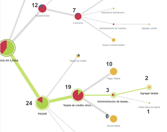
- Mapped and reviewed existing flows.
- Collected customer advocacy reports and NPS data.
- Analyzed qualitative and quantitative feedback to understand user motivations and frustrations.
Key Findings
- Some customers feel more secure using the desktop application for banking.
- Users reported missing essential features like easy fund transfers, statements, and transaction history access, which are standard in modern banking applications.
- Performance metrics indicate that slow loading times hinder productivity and negatively impact user retention.
- There are low task completion rates and high abandonment for critical functions, such as transfers and payments.
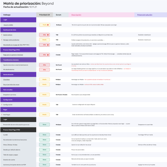
Expert Review (Midpoint App Assessment)
- Conducted an expert assessment and heuristic analysis with another designer.
- Documented usability issues and prioritized them on an effort-impact scale.
- Presented findings to stakeholders for prioritization and backlog planning.
Design Process
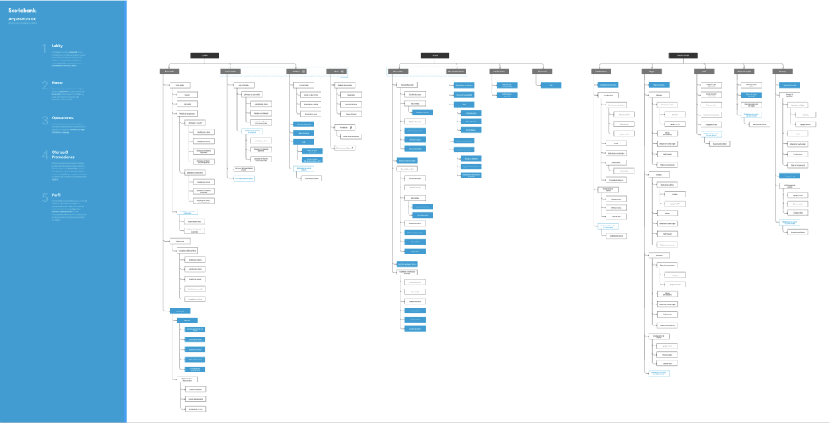
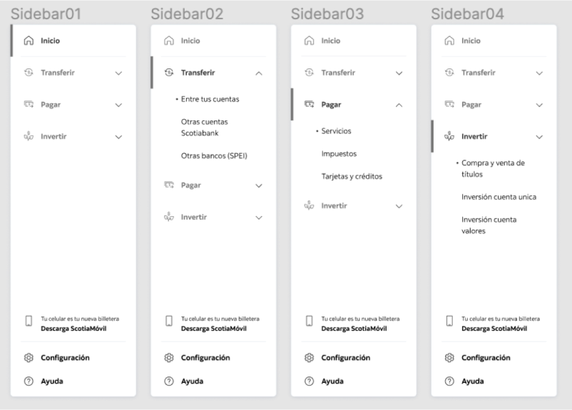
Information Architecture
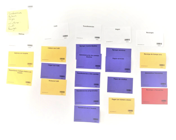
- In collaboration with UX research, we planned and conducted Card Sorting and Treejack Studies with target users using Optimal Workshop.
- The studies helped us have a better understanding of the user’s mental models, and to identify the navigation paths taken for key transactions.
Wireframes
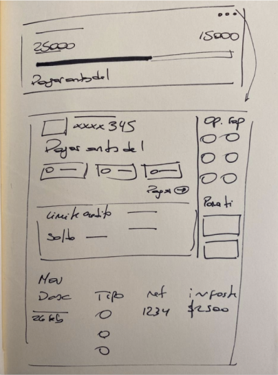
- Started with hand-drawn wireframes and evolved into low-fidelity quick concepts.
- Iterated and refined designs based on feedback from PMs and business line representatives during review sessions, which also helped figure out the content structure, required data to show, and also lead us to explore some UI components from the design system.
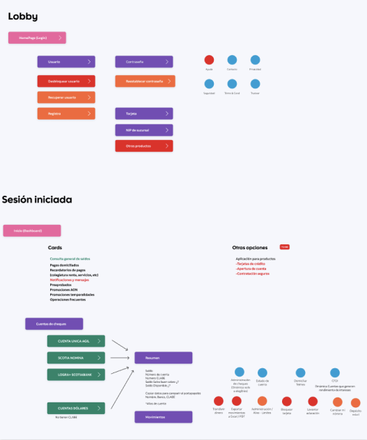
User Flows
- Incorporated UX writing for clarity, actionable messages, and brand’s voice and tone alignment.
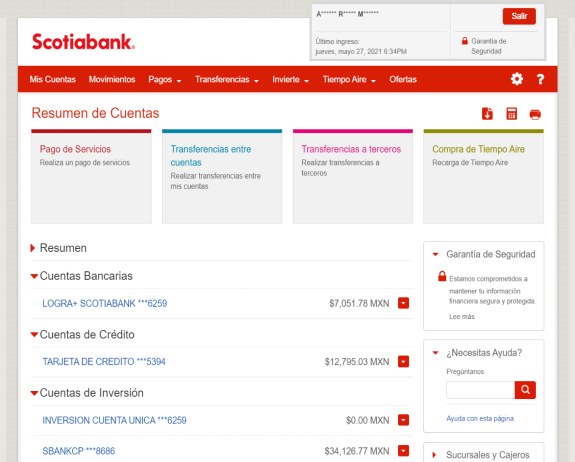
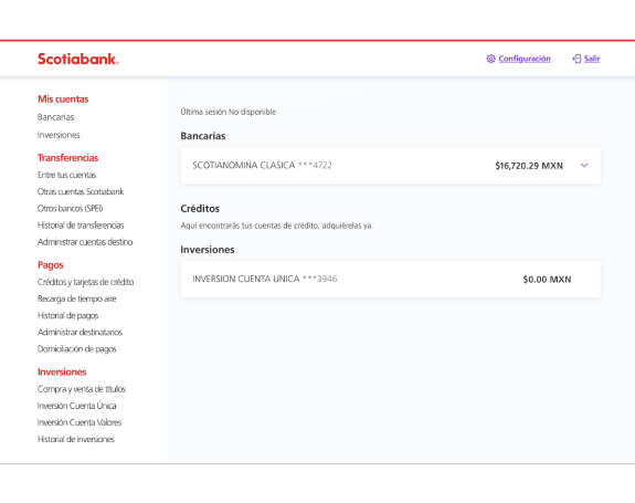
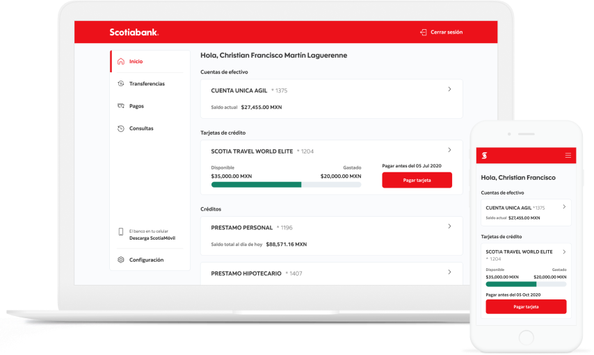
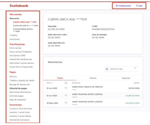
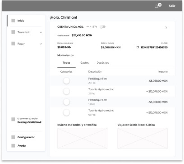
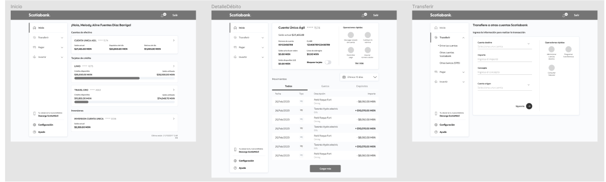
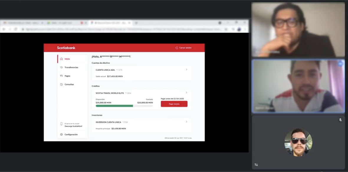
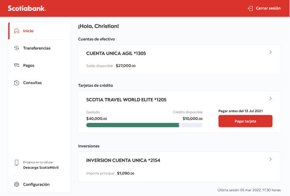
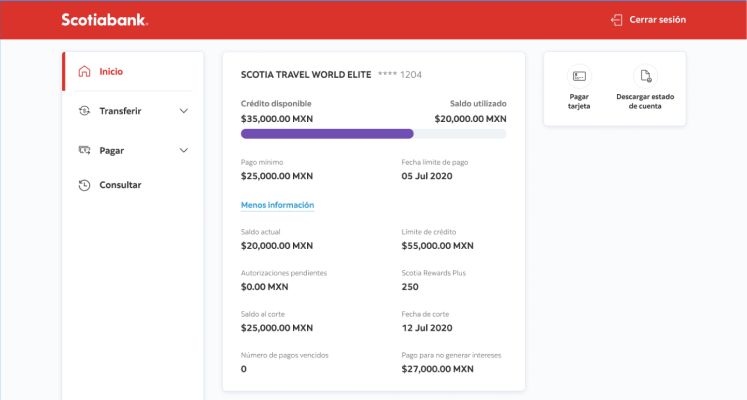
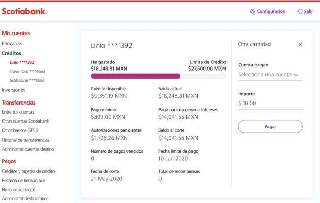
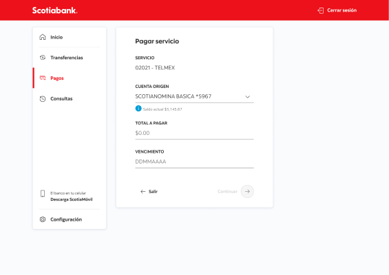
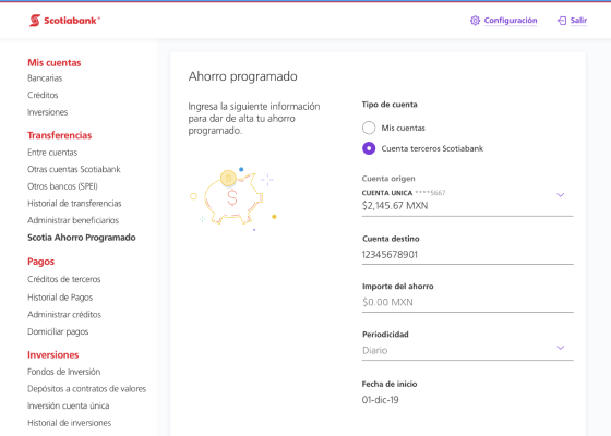
- Redesigned dashboard, account details, and transactional flows.
Prototyping
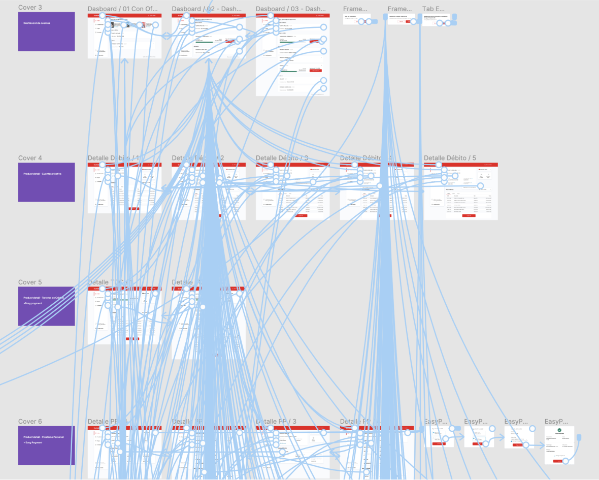
- Built a High-Fidelity Interactive Prototype using Figma to showcase the main flows.
- Used for stakeholder demos and usability testing.
- Due to time constraints, usability testing was not conducted before launch. Instead, design decisions were guided by research insights and best practices and will be validated in real-world use post-launch.
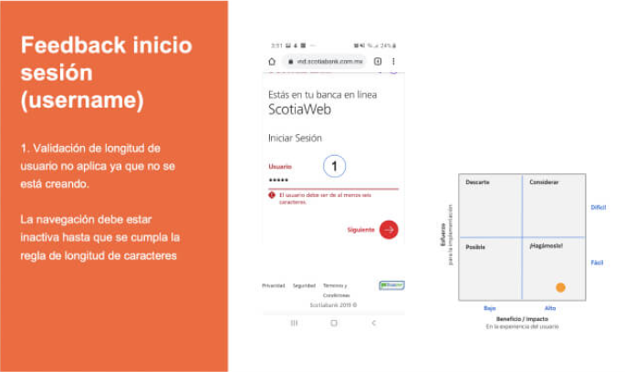
Usability Testing
- Involvement with the research team to adapt prototypes to scripts for conducting Usability Testings for comparing the old vs the new interface in a common journey. Also served as note-taker during the interviews.
- Used Think-Aloud technique to assess usability, information hierarchy, and content clarity.
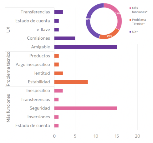
Key Findings of New Interface
- Users easily found account information and shortcut actions
- Some mandatory data was unnecessary and difficult to understand
- Users appreciated small enhancements (e.g., copy account number feature)
- Key information needed to be more visible without extra clicks
Visual Design
- Iterations were made based on key insights of the usability testing.
- Defined a set of templates and local components to style the web responsive and desktop mockups to keep consistency across screens, and improving design times (design work was led by another designer and me).
- Adopted the design system’s typography, text styles, color palette, iconography and voice and tone guidelines.
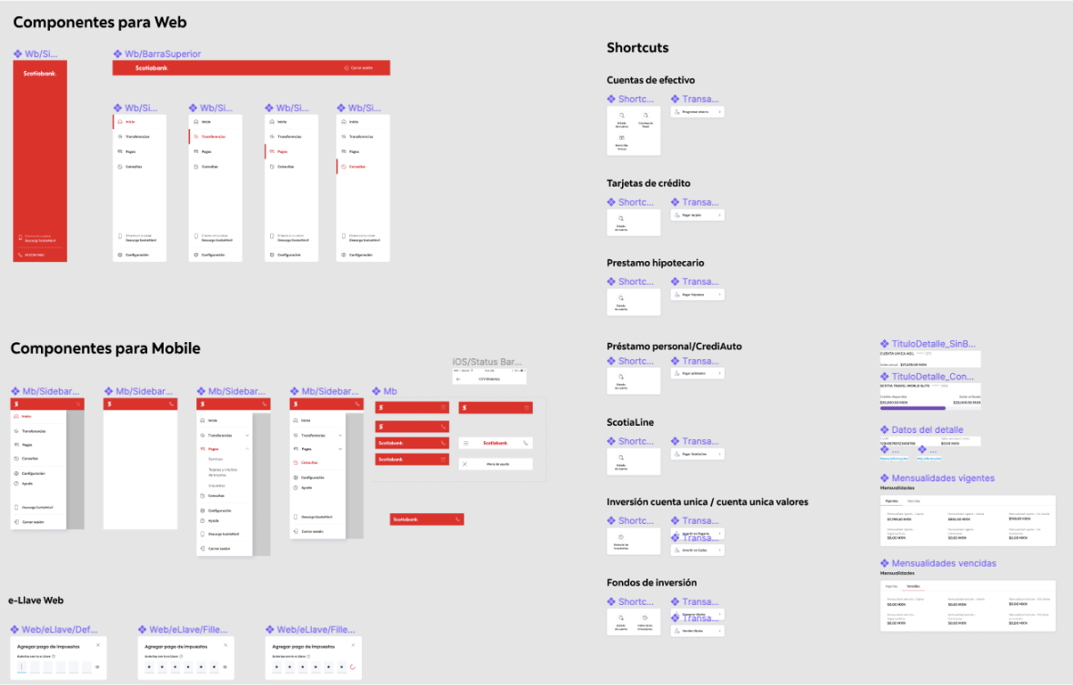
- Finally, we used the local library components to create high-fidelity mockups and documentation for handoff designs to development teams.
- We followed up and supported development in regular check-ins with front-end developers to clarify doubts and document edge cases
- Showcased the progress and new iterations in the scrum sprint demos with stakeholders.
Final Design
Results
- A cleaned-up user interface.
- Simplified navigation and shortcuts to main tasks.
- Clearer and more user-friendly content.
- A web-responsive UI, which helped development introduce embedded cross-platform solutions from desktop to into mobile in next projects for onboarding users and password reset features).
Impact
- Positively impacted +500k existing clients, reflected in higher adoption, lower attrition, and an improved NPS score.
- Simplified processes for completing main banking tasks, leading to more transactions with fewer frictions and less time to complete.
- Compliant with usability heuristics and accessibility standards.
- Aligned with global design system guidelines and branding.
- Set the basis for scaling the product and adding more features.
Lessons Learned
- The project highlighted the power of user feedback to demonstrate problems, gain stakeholders buy-in, and demystify assumptions.
- Usability testing helped us identify pain points, decide between A/B options, and make corrections before development, guiding and justifying design decisions.
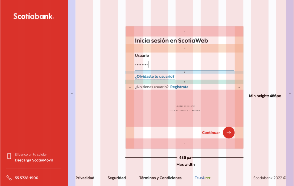
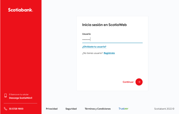
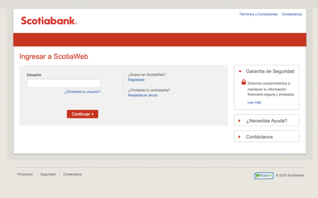
- Due to legal and security requirements, we had to find elegant solutions that balanced compliance and experience (e.g., splitting the login form into two screens instead of one with both username and password). A solid content strategy also played a key role in improving the experience.
- Involving UX early in development is crucial. This project had a "mid-term" solution designed two years before, but since it was a closed-door project, the initial result led to a poor experience. Our design squad was later assigned to create a remediation plan to get the product market-ready.
Next Steps
- After the release, we continued enhancing the product based on users feedback that helped us action new opportunities, and worked on new features such as geolocation (legal project), and customers onboarding. Additionally, we tackled one of the biggest pain points—eliminating waiting times for transfers and broke the desktop only dependency for onboarding users in mobile.